Monday, 4 February 2013

Task 8

Polar co-ordinates 

Today we completed a tutorial on using polar co-ordinates.
Firstly, we took an image of New York, duplicated it and flipped the duplicate horizontally. 
Next, we flattened the image and rotated it by one hundred and eighty degrees. 
After this, we went to image, image size and un-ticked constrain proportion. After this, we then made the width the same as the height.
Next we went to filter, distort and chose polar co-ordinates. This create a circular image.
To make the image look better, we then adjusted the brightness and contrast to make the background black.      


Consumerism

After watching videos on www.storyofstuff.com I decided create a poster based on the issue of consumerism.

The idea behind the my first poster is asking you what brand do you buy and how it becomes a part of you as you buy more and more of a brand.

After completing a tutorial, I took what I learnt and applied it to my previous poster. I took my brand man and duplicated it nine times and distorted it using polar co-ordinates. I then got an image of Earth so it would look as if the brands are running the world.  

This image was about how the brands we buy get thrown out eventually and we may not consider the effects on the environment.
I feel i have created some good posters for consumerism and I think that the first two images are better as the third image I created is a bit unclear.

Task 7

Life of the plunger
Over a period of two days, we created an animation using a plunger, a camera and Photoshop to add to the visual effect. The animation was made up of four hundred and sixty four images. 

Monday, 7 January 2013

Task 6: Adverts


This advert is very clever as it is shows use that the boundaries of a child's play are is very wide. It is telling use to constantly keep an eye out for children playing in the streets because they will play anywhere.  

Coca-Colas intelligent new advert shows you how you can literally get gripped to Coca-Cola. This advert is very clever as it makes great use of the area as it is in a bus stop. This advert is good as it will get peoples attention and make them talk about it and remember it. But I feel that many people would have got annoyed by it as it might of wrecked their clothes.

This advert is about poverty and hunger of other countries. It makes great use of a trolley as people will just throw food in and it will make them understand that as easy as it is to take for yourself, it is as easy to give to others.
http://www.ibelieveinadv.com/commons/feedsatrolley.jpg

This web banner for NHS is for Dementia and makes great use of its space and its interactivity feature. It makes a person want to go and see what it is. It rolls and loads a video so you can learn about dementia and how you can get help through interviews with famous people. Although this is on a kids game website, they will still be interested into looking at what this advert provides.


The Honda advert "Cog" have become a famous advert as it is extremely clever. It shows use how intelligent Honda are and that their cars are incredible, down to the last bolt. It uses parts of the cars to create a domino effect and it is done with nearly every part of the car to get to the finished product.


The force Volkswagen advert is very entertaining. This advert shows a child in a Darth Vader outfit, going around the house trying to get things to move with the force but he fails. His dad returns home in his Volkswagen and the child runs out to use his force on the car, his dad gives him a helping hand by using his car keys to control something with the car which makes it flash its emergency lights. The child looks at his farther in amazement and then the car is revealed. It is showing use that this car is a family car and it is capable of being great. 


Magazine advert for suntan lotion
This advert makes  great use of the centre fold by it having reflective pages which makes you want to use it and get a sun tan. This provides the opportunity to catch the sun easily, but it cleverly have an image of the sun tan lotion, therefore, forcing you to go out and buy that sun tan lotion as it have given you these pages. 


Magazine advert for DHL
This advert is clever as it uses clear plastic which has in image on. This lets you interact with it and it almost lets you be part of there delivery service and understand how efficient they are. This is a clever advert and will interest people a lot and make them think that DHL are an intelligent and efficient company.  


Monday, 19 November 2012

materials & textures


Lighting effects


To start with we changed the foreground to brown and the background to grey. After this, go to filter, render and clouds. Also going to filter, noise and add noise.


Then click channels, add channel and then it gives you an alpha channel. Then go to filter, render and clouds.

After this go to filter, render and chose lightning effect which gives you the rock effect. 

Textures from around the college

We went around college with paper and a graphite pencil and collected textures from around the college. Some of the textures were from elevators, railings, wooden tables,walls, sculptures, bricks and other textures.

These textures were from the elevator and from the railings near the elevator, as well as the textures from the walls around the area.

These textures were from the walls out side and from the wooden tables outside.

These three textures were all from the walls around the college giving near enough the same texture.

These textures were from a sculpture, the wall textures near the wall and some metal that was at the bottom of the wall outside.

This was from a post box that was attached to the wall outside.

These textures were also all from the walls and of bricks.

I then used one of the textures to create a pattern to use as a back ground and a fill for the text using a simple texture.


This was easy to create as I wrote up how I created a piece similar to this because of a demo that we did before. I like this technique and I feel I will often use this in future work.

I repeated the process on another texture but I decided not to involve text into the piece as I liked what I created from a simple texture.


 Firstly I opened a new document at the size of 640 x 480. I then set the foreground colour to to #6edbff and the background colour to #000000.
Then select Filter, render, clouds
then filter, filter gallery, artistic, plastic wrap and then apply these settings
Highlight strength - 10
Details - 5
Smoothness - 3


I then went to filter and chose oil painting and messed around with the setting to get this piece.

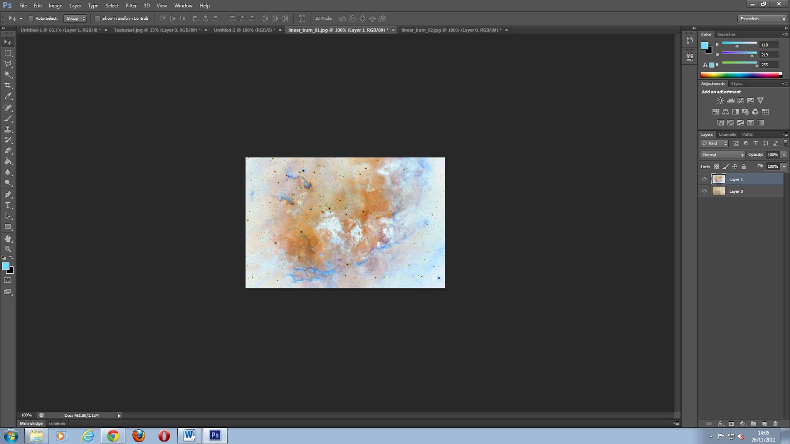
Firstly I took these first two images from a tutorial online. The second image had to be the top layer and then hold Ctrl & I to invert the image. Then chose linear burn and then reduce the opacity slightly.  


Render, fibres - variances 16 and strength 4. Then blur, Gaussian blur - 3.0 pixels


I inserted clouds, then went to sharpen. Filter, pixelate, fragment. I then used the lighting effect. 


I used the same texture for this piece. In alpha I made the foreground colour #4fc1a7 and the background #000000. I then added clouds and then went to pixelate and chose mosaic and moved the lighting effect around.  

 In Alpha, I went to Filter gallery, Artistic and chose sponge. I then added noise.